
THEMONEYHABIT.ORG – Jangan Sampai Keuangan Bocor!
Pernah nggak sih, Sob, kalian merasa sudah tahu persis berapa uang masuk dan keluar setiap bulan—tapi tetap saja uang di rekening menipis di akhir bulan? Atau sebaliknya, kalian merasa sudah…
Pernah nggak sih, Sob, kalian merasa sudah tahu persis berapa uang masuk dan keluar setiap bulan—tapi tetap saja uang di rekening menipis di akhir bulan? Atau sebaliknya, kalian merasa sudah…
Halo, Sobat Finansial! Selamat datang kembali di blog kesayangan kita. Bertemu lagi dengan saya, admin yang akan setia menemani kalian mengulik berbagai fenomena ekonomi yang menarik untuk dibahas. Penasaran kenapa…
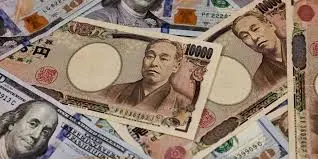
Sebelum kita masuk ke penyebabnya, mari lihat dulu fakta terkini yang cukup mencengangkan. Yen Jepang tercatat melemah ke level 159,40 per dolar AS. Angka ini mendekati level psikologis 160 yang sangat…
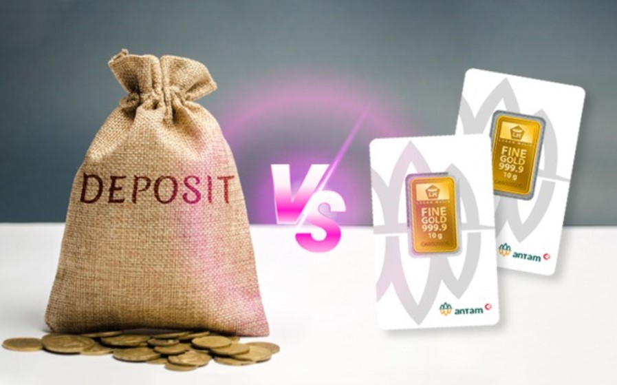
Di tengah ketidakpastian ekonomi dan fluktuasi pasar, banyak masyarakat mencari bentuk investasi yang aman namun tetap menguntungkan. Dua pilihan populer di kalangan investor konservatif adalah deposito berjangka dan emas logam…
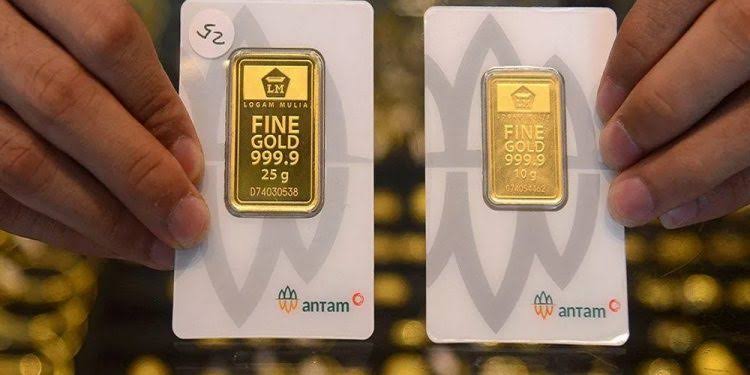
Harga emas kembali mencetak rekor tertinggi dalam beberapa tahun terakhir. Bagi investor lama, ini bisa menjadi sinyal untuk merealisasikan keuntungan. Namun bagi calon investor, muncul pertanyaan besar: apakah sekarang waktu…

Mengelola arus kas (cash flow) usaha adalah kunci utama untuk menjaga kelangsungan bisnis. Namun, sering kali pelaku usaha, khususnya UMKM, terlalu fokus pada pemasukan dan pengeluaran operasional sehingga lupa satu…
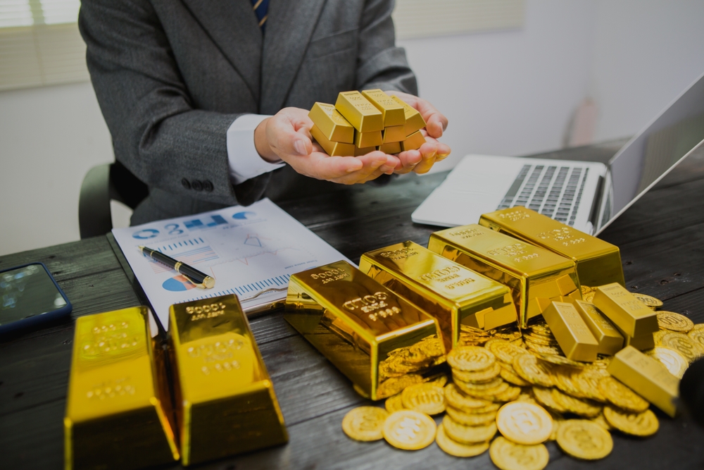
Harga emas terus menanjak dan bahkan menyentuh rekor tertinggi dalam beberapa bulan terakhir. Bagi sebagian orang, ini adalah tanda untuk ikut membeli sebelum harga naik lebih tinggi. Namun, bagi investor…

Asuransi sering dianggap sekadar kewajiban rutin: bayar premi tiap bulan, lalu berharap tidak pernah menggunakannya. Padahal, kalau dimanfaatkan dengan bijak, asuransi bisa jadi alat penting untuk mengelola keuangan dan meraih…
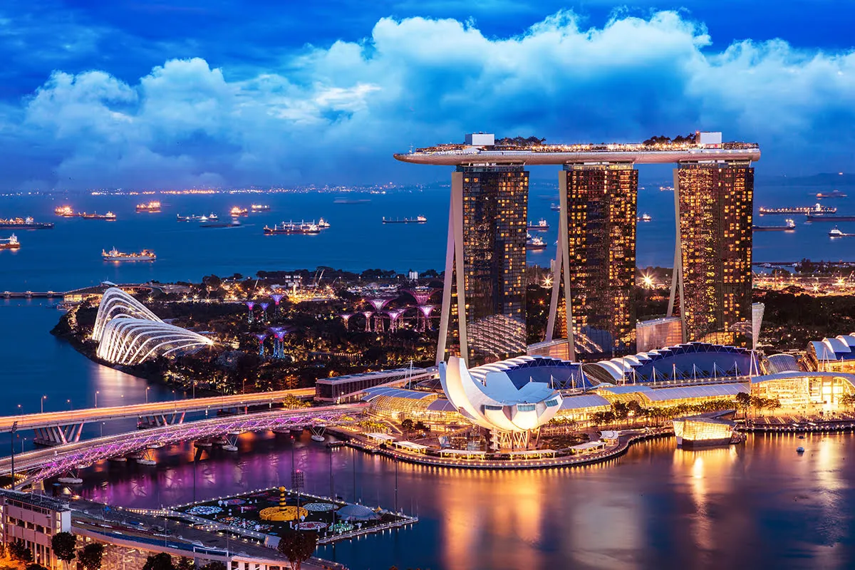
Bekerja di Singapura menjadi impian banyak orang karena negara ini menawarkan gaji yang kompetitif, lingkungan kerja profesional, serta peluang hidup yang lebih baik. Namun, meskipun penghasilan di Singapura relatif besar…

Sifat boros bisa menjadi hambatan besar dalam mencapai kebebasan finansial. Seringkali, tanpa disadari, kita menghabiskan uang untuk hal-hal yang sebenarnya tidak terlalu dibutuhkan. Untuk mengubah kebiasaan ini, diperlukan kesadaran, perencanaan,…